Inside Sketch: How we redesigned our homepage and blog
Get the inside scoop directly from our marketing web team
Author
For our web team, revamping our home page and blog has been a truly enriching experience. Because they’re a small team, designers get to work closely with developers in the early stages of any project, bringing everyone’s expertise to the table. In the case of the homepage redesign, it also served as a great opportunity to give back to the community by shining the spotlight on Sketch creators.
Recently, we chatted with the wizards behind our website curtains to learn more about how this project came to be.
How did you come up with the idea for the new homepage design? Can you walk us through your brainstorming process?
It all began with the idea of showcasing and promoting other designers’ work on our homepage in a way that wasn’t just a small section in the middle of the page. Our product is what designers use on a daily basis to do their jobs, so why not demonstrate what can be achieved with Sketch, rather than just selling a tool? This was the initial concept for the hero design of the homepage.
The idea of custom homepages came later, keeping in mind that we had limited time to create this page. We started working on it in November and released it in January of this year.
I recall writing this idea down in a Slack thread where we were discussing and collecting different works from designers that we wanted to showcase on our regular homepage. We wanted to show our appreciation to a handful of designers in the community by featuring their work on a custom version of our homepage, complete with a custom URL.
Our product is what designers use on a daily basis to do their jobs, so why not demonstrate what can be achieved with Sketch, rather than just selling a tool?
We managed to launched on January 4th with 14 custom homepages. A few more were added later, and we’re open to creating even more. (Psst! Give me a holla, and I might be able to bring one of your Sketch creations to our homepage!)
We kept it all a surprise for the designers in question, and everyone enjoyed it. Recently we also added a couple of new editions — one showing off the winners and honorable mentions of our One Layer Challenge and another one for Valentine’s Day. Surely more will come! — Augusto Lopes, Lead Web Designer

It looks better live 😉
What was the greatest challenge you faced technically, and how did you overcome it?
Believe it or not, the biggest challenge was the smallest, nice-to-have features, both on the homepage and Beyond the Canvas blog!
When working on the homepage, I aimed to make it look as close to the product as possible while also appearing natural. However, simulating cursor movements posed a challenge. It wouldn’t look natural to simply write a couple of CSS keyframes with cursor positions. Instead, I settled for using Perlin noise and its JavaScript implementation. This allowed me to generate multiple coordinates in 2D space that were close to each other, making it appear as though cursors were moving randomly (and naturally!).
The other challenge was perfecting interactions with Artboards and other UI elements in the hero section — such as comments and the prototyping arrows — to behave just like in the Mac app. Ensuring that clicking, dragging, dropping, and other interactions worked in all different scenarios and resolutions was definitely difficult — but also a fun part of working on this project.
As for the Beyond the Canvas blog, the biggest hurdle was ensuring that all of our pre-existing blog posts remained intact, even with the new design. Having an appropriate design system definitely helped us in that process, so going back to old blog posts and making tweaks to suit the new design wasn’t a big deal. — Vladan Vukmanov, Marketing Web Lead
Why did you feel it was time to revamp Beyond the Canvas, and what were you hoping this new design would unlock?
We had this idea of making Beyond the Canvas a platform for us to talk about design industry topics more broadly, outside of the constraints of the Sketch brand. Turning it into more of an online magazine for sharing interesting, thought-provoking, and useful articles, videos, opinions and more. In a nutshell, Beyond the Canvas is our new home for design industry content at Sketch.
In terms of the overall design approach, we wanted it to become its own sub-brand within Sketch. The look and feel is different but still not entirely far from the main brand — still complemented by the same font and other small details tying it back. As we bounced ideas around, we all agreed it needed to be simple enough to let the content do all the talking.
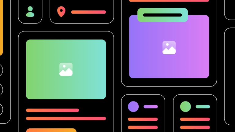
In the end, we came up with this new retro-feel design with toned-down colors, clean yet intricate illustrations, and straightforward layouts — allowing us to shuffle sections and components around. We stripped a lot of details from the main brand, like shadows, opacities, rounded corners and so on, almost bringing it back to basics to really focus on the articles and their varied content.
For us, as an internal web team, the new component-based approach unlocked many capabilities to efficiently build new sections and do quick updates. For our writers, it’s a solid platform to produce new and exciting content. And for Sketch lovers and the design community in general, we hope it’s a good resource for all things design! — Osvaldas “Oz” Poviliunas, Web Designer

The best feeling is when the category color and blog header happen to match 💅
From a development perspective, which feature of the blog redesign are you most proud of?
It’s difficult to pinpoint an exact feature since it was a complete redesign, but I can give some examples of things I enjoyed working on that proved to be more challenging.
Our initial approach to this project was to build it as a component library and then assemble all of it. This approach served as a great test of our ability to cooperate. I developed the first stages of the project, but when I was absent, Miguel picked it up and everything worked very smoothly. This was a great proof of concept for future component-based approaches to our website.
I really enjoyed working on the component for post listings since it started as three or four different components that eventually got condensed into a simpler, more efficient one. Oz’s simple and modular design was key to its reusability.
Another component that was really interesting to work on was the homepage hero slider and the heroes for the category pages — making those big color blocks come to life and adapt based on the current article or where you are on the website was a nifty little challenge.
Finally, the feature I’m most proud of though I didn’t take much part in developing is our navigation bar — it just looks great! 🤩 — Daniel Pereira, Web Developer
What’s your favorite thing about the new homepage design?
The stunning hero and its versatility! It has to be its versatility! I didn’t see its full potential the first time I saw the design files. I was doubtful about how it looked. Then I saw the implementation. I liked it. It was fun. You could drag the pictures like it was on an Artboard in Sketch. Nice easter egg, huh?
I learned later we would have a custom homepage for a couple of designers from our community, like Gavin and Viviane. Each one would get a fully customized hero with their work. How awesome is that? That might be the best idea someone had in the entire world that week. If it wasn’t, it felt like it.
Then, it’s February, we are at The Hague, it’s cold, and we’re at a company meeting. Someone is thinking about summer, suggesting we can use the hero of our brand new homepage to show images of a beach, the sun, and a multicolored parasol. A sandcastle bucket, one sandal, and a Bola de Berlim — a German dessert with a Portuguese spin that’s become a beachside staple.
This is nuts! I hear my mind roaring like an American muscle V8. We can use it to promote events and special dates. There are endless possibilités. So how about collecting Valentine’s arrows on February 14th?
The design and its development made it very easy to change the whole feel of our main page. So, for an Easter eggs fan, the hero has to be my favorite thing about our homepage. — Miguel Antunes, Web Developer

Missed out on this special edition homepage? Stay tuned for our next one!
What’s in store for the future
Aside from more fun explorations like our Valentine’s Day special, the web team’s currently working on adapting a component-based approach so designers can work off of a Library that mimics what developers see on their end. The goal is to make the process more efficient and reduce the number of quality assurance rounds.
For developers, working alongside designers helps set challenges and makes their job more dynamic. Our homepage is living proof. Their small team of two designers found a new way of rocking the web through a visually astonishing design. And our blog — Beyond the Canvas — allowed the team to explore a component-driven approach. And they’re still excited to continue achieving more with our website.
So stay tuned for more!


