Your guide to Overlays — a powerful way to make interactive prototypes
Add modals, sheets, pop-up menus and more to your prototypes
With Overlays, it’s simpler than ever to create richer and more interactive experiences. They’re easy to work with, but we’ve included plenty of customization options so you can make your prototypes feel more realistic.
We’ll walk you through everything you need to know about Overlays, including some of the controls and options you won’t find anywhere else. Let’s dive in.
What the heck is an Overlay?
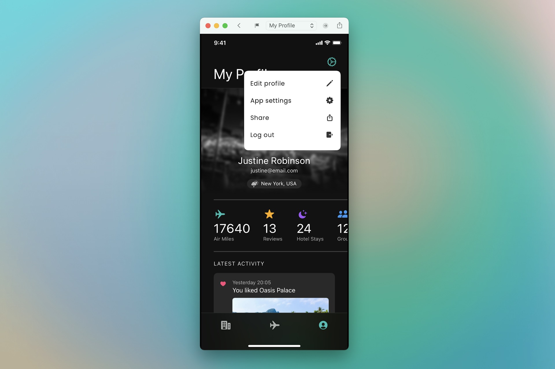
An Overlay is an umbrella term for any type of interaction or message that appears on top of the existing UI. Some examples include an iOS-style share sheet, a popover alert, or even an interaction-blocking modal that demands attention. In other words, Overlays can come in all shapes and sizes.

An Overlay is an umbrella term for any type of interaction or message that appears on top of the existing UI — including iOS-style share sheets, interaction-blocking modals, or even the settings menu in the image above.
How to create Overlays
We’ve made the prototyping process smoother by splitting the Inspector into two tabs: Design and Prototype. That means you’ll find all the Prototyping settings you need in their own section — including Overlays.
There are two different ways to create an Overlay. One option is to select the target Artboard, head to the Prototype tab of the Inspector and click Overlay.
You can then create an interaction just as you would with any other layer. Hit I, select the layer you want to trigger your interaction, then select the Overlay. It’ll appear on top of your Artboard when you preview your prototype! Of course, you can also add an interaction by drawing a Hotspot.
There are a few ways to create an Overlay. One is to select an Artboard, then head to the Prototype tab of the Inspector and click Overlay. Then, select the layer you want as the trigger, press I, and select your Overlay to create an interaction.
Alternatively, you can create a Link directly to any layer that’s smaller than the Artboard you’re linking from. And because it’s smaller, we’ll assume you want to make it an Overlay — so we’ll automatically create an Artboard around it and set it up for you.
When you link directly to any layer that’s smaller than the Artboard you’re linking from, we’ll assume you want to make it an Overlay — so we’ll automatically create an Artboard around it and set it up for you.
How to customize Overlays
Once you’ve set your Overlay, you can make it unique and realistic using a powerful set of customization options — from universal and one-off positioning to background styling and interactions.
Position with precision
You can customize exactly where your Overlay appears in your prototype, using one of two approaches:
- Align relative to Screen — your Overlay will appear at a fixed position in the viewport. This is a great setting for important alerts or warning messages that need to remain in the center of the screen even if you’ve scrolled down in the Preview. It’s also great for pulling up keyboards in mobile apps.
- Align relative to Layer — you’re setting the position of your Overlay relative to the layer that links to it. This is especially helpful when you want your Overlay to appear close to the interaction — such as having a search menu pop up — or if you want the overlay to remain on-screen and scroll with the rest of your content.
By positioning your Overlay on a specific point on your Artboard — or on the layer that triggers the interaction — you can create some really immersive experiences. For example, you could position an Overlay relative to a Symbol. Then, even if overrides change that Symbol’s size, the Overlay will always stay in the same relative position. We’ll dive into this in more detail in a later post — stay tuned!
Is your Overlay still not quite where you want it? No problem. You can define your Overlay’s exact position on the Canvas by giving it an Offset.
The power of Offsets
Offsets let you further customize where your Overlay appears on your Artboard — so you can be sure they always appear exactly where you want them to in every situation. You can control Offsets by selecting the layer that triggers your interaction, then dragging the Overlay preview to the position you want it to appear on the Canvas.

When you select your trigger layer, you’ll see a preview of your Overlay on the prototype itself, allowing you to adjust its position directly on the Canvas or in the Inspector.
Alternatively, you can use the controls in the Inspector — setting the position on the right, and then adjusting the horizontal and vertical offset based on that point. The Inspector’s offset controls are great for fine-grain positioning.
Setting default positions
You can also define the default position of an Overlay in the Inspector — which is great for things like touch-screen keyboards that always need to appear at the bottom of the screen. Simply select the Overlay itself, then use the Inspector to adjust the Offset. From then on, whenever you create an interaction to that Overlay, it’ll default to that position.
But guess what? You can even override that default on a one-off basis. So if you need a menu Overlay to appear in a different spot on one specific screen, you can do it. Just select the layer or Hotspot that triggers that interaction, then drag the Overlay to its new position on the Canvas, or use the controls in the Inspector.
If you override the default positioning, you can use controls in the Inspector to make that the new default, or revert it back to its previous default position.
Stacking Overlays
Want an Overlay on top of an Overlay? No problem! You can stack Overlays on top of each other — even if they have different positions. For example, you could stack a keyboard layer on top of a search menu.
You can stack Overlays on top of each other, regardless of their position. And remember — if you link to a layer that’s smaller than your original Artboard, we’ll automatically create an Artboard around it to set it up for you.
You also can set an Overlay to close all existing Overlays whenever it shows up. Just select the Close existing Overlays checkbox in the Inspector.
Beyond positioning, there are also plenty of styling options. To emphasize an Overlay, for example, you can blur or dim the prototype in the background.
Want to limit interactions outside an Overlay when it appears? Choose between multiple Interaction settings in the Inspector. For example, you can decide if it’s possible to click outside a pop-up menu to dismiss it. You could also block interactions altogether.
But if you want, you can still allow both clicking and scrolling — even with an Overlay showing. This is a great option for low-priority alerts or notifications that don’t require immediate attention.
You can decide if it’s possible to click outside an Overlay to dismiss it — even with multiple Overlays showing. Just select the Overlay and choose your preferred interaction setting from the Outside Interaction menu in the Inspector.
Overlays have been available since Version 90 of our Mac app — so make sure you’re up to date! And of course, when your work is ready for feedback, you can share your prototype with anyone in your team to test for free through the web app and iPhone app.
We hope Overlays speed up your workflow and help you create more immersive experiences. We’ll be diving deeper into this in a future post, as there are some powerful use-cases that we think you’ll love.
As always, we’d love to know what you think, so feel free to share your thoughts. In the meantime, happy prototyping!


