Wireframe vs mockup vs prototype: What’s the difference?
Discover the differences between wireframes, mockups and prototypes — and when to use them
When you’re creating pretty much anything, it’s common practice to start with a draft. Drafts help you work out the kinks before sending your creation out into the world.
If you’ve drafted a design or worked on a product, you’ve probably heard the terms wireframe, mockup or prototype. You might think they all sound quite similar — but there are some important differences. In this article, we’ll compare wireframes vs mockups vs prototypes, how they’re different, and when to use each.
Wireframe vs mockup vs prototype
Before we get to the detailed comparison between wireframes, mockups and prototypes, let’s look at the basic definitions of all three.
Wireframe: A wireframe is a blueprint or schematic that helps communicate the structure of your app or website to the relevant stakeholders.
Mockup: A mockup is a high-fidelity render of your design that showcases how the finished product will look.
Prototype: A prototype is an early model of a product that focuses on functionality and gives your stakeholders a taste of the final version.

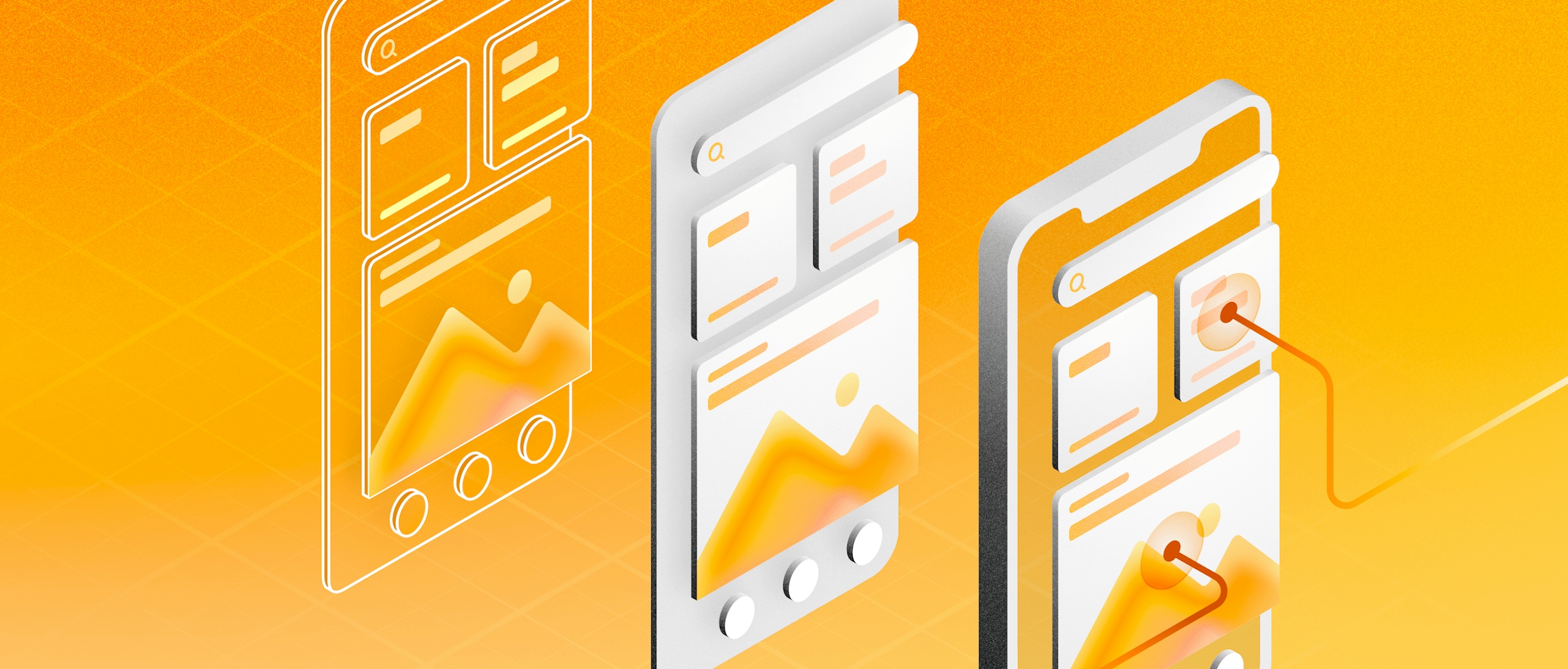
We can see the similarities and differences between a wireframe (left), mockup (middle) and prototype (right) in this example of a travel app.
In other words, each one serves a very different purpose. Wireframes communicate structure from a low-fidelity point of view, mockups highlight a product’s design from a high-fidelity point of view, and prototypes focus on a product’s functionality along with the design. Ultimately, though, they’re all different ways to draft your final product — showing different pages and screens.
Comparison
| Wireframe | Mockup | Prototype | |
|---|---|---|---|
| Purpose | Communicate structure and get early feedback | Showcase design | Showcase design and functionality |
| Fidelity | Low | High | High |
| Functionality | No | No | Yes |
| Skill requirement | Low | High | High |
| Resources | Minimal | Design tool | Design tool |
| Time needed | Very low | Medium | High |
| Product cycle stage | Discovery | Design | Prototyping and testing |
Wireframe
Wireframes are basic design layouts that present key information about your product and what you want to display. They also show your app or website’s page structure while providing basic information about elements in the UI.

When should you use a wireframe?
By framing your design concept in a minimalistic structural design, you can make quick adjustments. Plus, you can give everyone an idea of how your future design will look. Best of all, it means you can share your ideas early, without worrying about more complex design elements like colors, shading or intricate menus.
Let’s take a look at a couple of the use cases for wireframes:
- Communicate structure: The main purpose of wireframes is to share key information about the product’s design.
- Quick design: Wireframes should be quick, simple, and easy to modify.
- Product discovery: Designers and stakeholders use wireframes to identify business requirements, decide the scope of the product and more.
Before your team writes any code or allocates heavy resources to build a project, it’s important that everyone aligns on what they’re building. Using a wireframe helps everyone understand what you’re trying to achieve.
Mockup
Mockups are high-fidelity renders of your product’s design that showcase how the finished product will look. A mockup can take the shape of an image or a product model, and you normally create them using digital design tools.

An example of a high-fidelity wireframe of a mobile app that is also a mockup.
When should you use a mockup?
Now that we know what mockups are, we can dig deeper into what you can do with them.
- Product discovery: You can also use mockups before starting a project and test out different approaches to your potential product.
- Keep stakeholders aligned: Designing and building a product involves a lot of people — at every stage of the process. A mockup can help keep everyone aligned on the finished product, or even impress potential investors.
- The final step in the design: Designing a mockup is an important part of the product development cycle — usually happening during the design phase.
Regardless of how you use them, mockups help you communicate what you want your final product to look like. They are essential tools in your design arsenal — because it’s always better to over-communicate when it comes to design.
Prototype
Prototypes are models of your project that can take on different purposes. The most common use case is a design with a focus on functionality — which helps separate them from wireframes and mockups. Let’s take a look at when you might want to use a prototype.

Prototyping helps you figure out if your user flows are right.
When should you use a prototype?
Prototypes are a key part of the design process. They can help with:
- Usability testing: Prototypes are great for putting a working version of your product in users’ hands and checking that your design is useable before it ships.
- Idea validation: You can use prototype designs to share your idea as early in the design process as you like. It’ll help you and your team work out exactly what you’re trying to achieve.
- Collaborative designs: As prototypes help you test designs, you can and should involve as many stakeholders as possible. UX writers can help validate navigation, developers can test the functionality, and product managers can help you focus on user flows.
- Tempting investors and updating stakeholders: Sometimes you need a prototype to prove to stakeholders that an idea is worth taking to the next step.
Even though we’ve compared wireframes vs mockups vs prototypes, you can see that they are quite similar. Because of their similarities, you can develop one into the next throughout your design process. A wireframe can be an outline for a mockup, and adding functionality to your mockup can make it a prototype. Don’t limit yourself to just one of the three — take your time to figure out what you need and find the combination that works best for you.


