If you’ve ever used a smartphone or computer you’ve probably at least once wondered ‘how do I do this?’ This is the question a UI designer has to think about constantly when designing an app or website. But, before we can understand what user interface design is — we need to first define what a user interface is.
Basically, a user interface (UI) is the space where interactions between humans and machines occur — in our case apps and websites. That is still a broad meaning, but it brings us to the next question — what is user interface design?
What is UI design?
UI design is the design field that focuses on the look and feel of an app or website that we interact with. Unlike UX design, which focuses on the user experience, UI design focuses on aesthetics. The look and feel of an app can be the colors users see, the animations they interact with, the buttons they press, or the text they read. These fall under the job description of a UI designer.
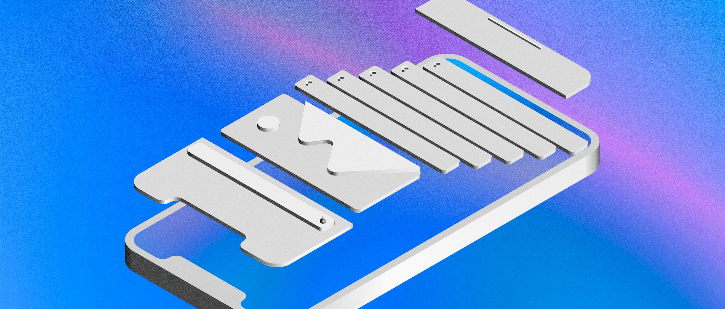
The UI designer works on bringing wireframes to life and creating prototypes that incorporate both the input from the UX designers as well as accommodating all of the brand needs. UI designers tend to every detail — from typography to logo use — and make sure that every project they’re working on matches other touch-points. For example, you want your app, website and landing pages to all look cohesive.
At the same time, UI designers can bring innovation to the design. Since they get to focus more on the creative side of the project, they can come up with more innovative ways to display information. Of course, it’s always good practice to check in with the UX designers again to make sure the interface design isn’t affecting the user journey.

Designing a UI for a website can be challenging, but its made easier with our Mac app’s intuitive UI.
Why is UI design important?
Since users can only interact with your app or website through the UI, its design will determine their main impressions. If you’ve tried any low-effort app or website you’ll know exactly how frustrating it can be to deal with a badly designed UI. Apps are now competing for users’ time, so you don’t have long to impress a user. In fact, according to Localytics, 71% of all app users churn within 90 days.
User interface designers bring a creative edge to the project, making your app or website stand out amongst the millions of other options out there. Even if you’re following a broader template of what a ride-hailing app or booking website should look like, creative UI design is how you can stand out.
On top of that, user interface design can make a difference in a product’s emotional appeal. Done right, UI design can pique your user’s interest and get them excited about exploring the product more. But otherwise, it could send them in the opposite direction.
Brand awareness also plays a huge role in UI design. By having all your designs follow the same guidelines, you can make sure that your product or service can become more recognizable. UI design doesn’t just stop with the design of a specific asset. By having it as a strong focus for your project, designers are able to design for the bigger picture of how it will all look and work together in the finished result.
Golden rules of UI design
To help you design these beautiful UIs — we’ve compiled a list of the main user interface design principles that you need to follow. Based on our own experience, as well as, Ben Shneiderman’s The Eight Golden Rules of Interface Design, and Bruce Tognazzini’s Principles of Interaction Design — we can simplify the golden rules of UI design to the following:
Put the user first
Depending on your project as a UI designer, you’re likely making an app for a broad range of people. You are a human being in the end with experiences and biases. It’s important that you put yourself in the shoes of any potential user. Sticking to familiar designs and practices goes a long way to ensuring that users with different experiences, ages and disabilities can all use your product effectively.
Constant feedback from the interface goes a long way to helping users interact smoothly. For every action they make there should be some sort of response that validates what they’ve done. This can help them correct actions or keep them focused on the next action instead of thinking of whether or not they did something. Your design has to also point out mistakes to users in a respectful manner to keep them on board.
Respect users’ time
For experienced users and updates, make sure that you aren’t surprising those that are familiar with your app. Users enjoy feeling in control and knowing how to get what they want. Users barely give the time of day to new apps and websites to understand how they’re supposed to work. If you’re going to take their time to onboard them on your specific UI, make sure it’s concise and helps them achieve what they set out to do.
Users are also annoyed by constant data entries or redoing prompts they already did. If you’re having them create a user account or enter some data, think ‘how fast can I get them back to what they want to do’.
Consistency is key
Striking the balance between designing something fresh that stands out, and still being familiar to new users, is a big challenge — but it’s worthwhile. Prompts, buttons, colors, fonts, copy, menus, and controls should all feel part of the same cohesive program.
If a user is lost from one screen to another or feels like a section looks and feels different they are more likely to backtrack or stop using your product altogether.
Don’t overload the user
As a UI designer for an app or website, you have a limited space to work with at a time. It might be tempting to get in as much information as possible to the user, but simplicity is your friend here. Users don’t want to be overwhelmed by a product, they want clear and concise.
If a user is going deeper into your app, give them an indication of how they got there — for example Men > Shoes > Sneakers > Fashion Sneakers. This will help them navigate easier, not have to worry about retaining information, and instead focus on the product or service in front of them.
User interface design examples
Now that we’ve covered the golden rules of user interface design, let’s see them in action. Here are some of our favorite user interface design examples — and why:
Headspace
For meditation lovers, Headspace needs no introduction. The wellness app boasts over 500 meditation exercises, each catering to a unique wellness topic. But if you’re new to their content and aren’t even sure what you’re looking for yet, you might worry about being overwhelmed, and close the app for good. Headspace lowers that risk from your first encounter with them.
The minute you create your account, the app invites you to try a simple breathing exercise, making it easy to get a taste of what their content’s like without having to scroll through a giant library first. They also invite you using short, specific copy that doesn’t leave you guessing what you’d be signing up for. Not to mention that it’s coupled with a big, clear Begin button. That means you spend less time learning about what the page is asking you to do, and more time trying out the content.
Don’t want to get forced into a breathing exercise upfront? You’ll easily find an exit button on the top right of the screen, allowing you to opt out and explore the app for yourself. What’s worth noting is that the exit button is clearly visible, yet isn’t so big that it competes for your attention with the Begin button. It all helps to keep the page’s main intention crystal clear — and super simple to follow.

Your Headspace journey starts the minute you create your account, as seen in how easy they’ve made it for new users to try their first exercise.
1Password
Few password managers come close to 1Password’s slick and simple user interface. When you open the app, you’re met with a locked digital vault that only gives you one way to interact with it: by entering a master password. No password? No entry. In other words, the user interface is designed to do exactly what a password manager is for — it protects your passwords from unwanted guests.
Sure, it’ll be up to you to come up with a highly complex and memorable password that’ll lower the chances of someone else cracking the code. But 1Password has plenty of tips! And once you’ve got that sorted, you won’t have to worry about anyone getting to see anything unless they know your super secret master password.
It’s all in the name: one password to rule them all.

1Password’s design makes the password manager’s purpose clear: all you need to do is remember one password. Then, you’ll unlock them all.
AirBnB
Looking for travel accommodation can be a nightmare — especially if you’re trying to tick multiple boxes like affordability, location convenience, size, and comfort. That’s why AirBnB’s user interface keeps so many travelers coming back. The idea is simple. You type in the city or country you’re going to, enter the dates you’re looking at, and then get a bunch of search results for listings in that area.
Each listing highlights the most important information for the user upfront: a photo of the place, the price per night, the number of beds, an average rating out of five stars, and whether it’s a private room or an entire place. On top of that, each listing even gives you a price estimate for how much you can expect to spend in total based on the dates you picked.
That’s a lot of information to get without having to click on a listing first. Talk about respecting the user’s time!

AirBnB lets you scroll through travel accommodation listings alongside an interactive map that gives you a clear idea of what neighborhoods and districts you’re looking at.
Now that you know what UI design is and why it’s so important — it’s time to take the golden rules and apply them for yourself. Whether you’re are an experienced designer or budding student, these principles will be with you always. You can also check out our free beginner’s course to learn more about designing in Sketch.
If you’re just learning about UI design — we hope this post helped you appreciate how much of an impact it has on the quality of a product.


