Author
As a designer, you probably already have a good idea of what typography is. But maybe you’re looking to dive in a little deeper and get a good grip on what it’s all about. That’s where we’ve got your back. In this blog post, we’ll be walking you through what typography is and why it matters. We’ll even share a few tips to get you thinking about words like a true artist!
So let’s jump into the A-to-Z of typography — pun intended 🤓
What exactly is typography?
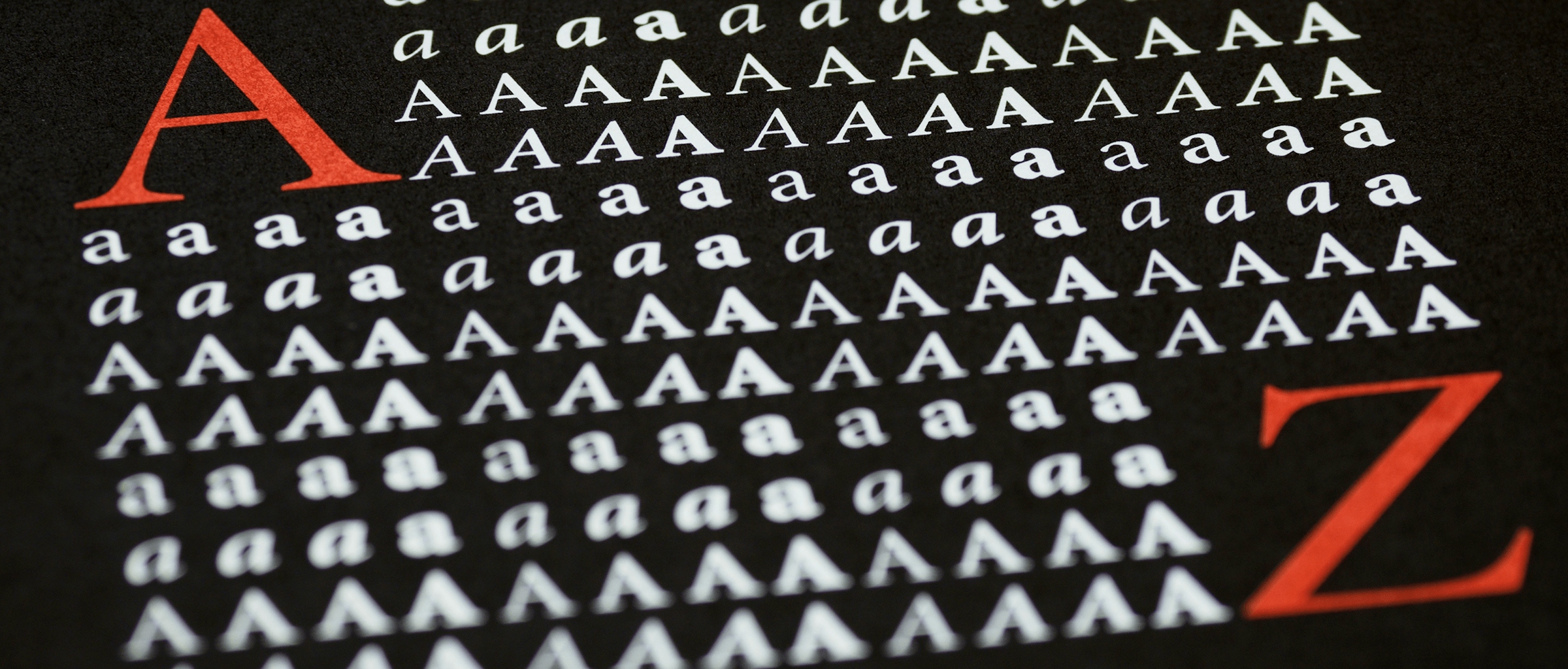
Typography is a graphic design technique that’s all about arranging letters and words in a visually appealing way. And while choosing a good typeface can certainly set you up for success, that’s just scratching the surface. Typography also involves choosing the right font size, colors, and shadows, and adjusting the space between letters, words, and lines.
Typography comes in handy for any design that includes text — whether you’re designing an album cover, a poster, an app, or a website. Making words look good can make all the difference.
Why is typography so important?
While typography can certainly brighten up a design, it’s about so much more than making things look pretty. In fact, you can apply typography techniques to make your text legible, readable, and visually appealing.
Think about it — the words on a page or screen are what convey the message to the reader, and the way those words are presented can make or break how digestible your message is. When you get typography right, it can make your design feel polished and professional.

While typography can help make your text more aesthetically pleasing, it’s also about making it more legible.
3 tips to master the art of typography
Here are three tips for typography that will help you take your designs to the next level:
1. Pick the right typeface for the job
The typeface you choose can have a big impact on the overall look and feel of your design. When you’re picking one, think about the purpose of your design and the message you’re trying to convey.
For example, if you’re designing a poster for a rock concert, you’d probably want a bold and edgy typeface to convey energy and loudness. If you’re designing a website for a ballet school, you might want a typeface that reflects delicacy, precision, and elegance. From there, you can adjust its size, pick the right colors, and maybe even add some shadows to make your text punchy.
Depending on your design, mixing different typefaces could work best — like combining a serif and a sans serif font.
2. Pay attention to spacing
So you’ve settled on the right typeface and styled it to your liking. There’s just one problem — it’s not the most legible piece of text. That’s where typography techniques like kerning and tracking come in handy. Kerning is all about adjusting the space between two letters at a time, which is especially useful when you’ve got two similarly-shaped letters next to each other — like an ‘A’ and ‘V’. Tracking, on the other hand, lets you adjust the space between multiple letters at once.
But apart from the horizontal spacing between words and letters, it’s also worth keeping vertical spacing in check. If you’re working with a paragraph — say for a book blurb, magazine spread, or website copy — you’ll want to make sure the lines aren’t too close or too far apart for readability.
3. Be consistent
Some designs involve multiple text layers with varying styles. And that’s okay. The most important thing, in this case, is to be consistent with your choices. That doesn’t mean you’ll have to limit your design to one typeface or size. Rather, it’s about regulating the look and feel of your design to give it a cohesive look, all while making it easier for readers to consume.
For example, in a magazine spread, you’ll probably make your quotes much larger than the article copy — or even make them different colors. But to keep things consistent, you might want to make sure all your quotes come in the same style to easily distinguish them from your body copy.

Being consistent with your typography choices can make your whole design feel more cohesive.
Ultimately, it’s all about creating designs that are both fun to look at and easy to read. So whether you’re creating marketing content or designing a user interface, understanding typography will take you far.
Now that you know what typography is, it’s time to go make some words look good! Next time you spot a header or a logo you’re not a fan of — whether it’s on a website you stumble on or your laundry detergent bottle — why not try revamping it? And if you like what you’ve come up with, feel free to tag us on Instagram or Twitter using the hashtag #MadeWithSketch — or share it in our community forum ✨


