ICYMI: 38 recent Sketch improvements you might have missed
Here’s a quick rundown of some of the little gems we’ve released in the last few months
We’ve been busy here at Sketch in the last few months — with big improvements to Prototyping, Workspace documents and Artboard Templates. And with all these feature releases, it’s sometimes easy to miss some of the smaller (but still sweet) improvements we’ve made along the way.
So today, we’re running through 38(!) of these little gems in one epic blog post. Want to see them all in less than four minutes? Our very own Joseph Todaro has got your back in the video below. Got a little longer? Read on below…
1. Navigate between documents faster
Working on the Mac app? It’s now easier than ever to browse through your documents in the Workspace window using the arrow keys ↑↓←→.
2. Select multiple documents at once
We’ve made it easier to manage the documents in your Workspace. The Workspace window now supports multi-sections, so you can move and delete documents in bulk.

3. Rename pages with a shortcut
You probably already use the ⌘R shortcut to quickly rename layers in the Mac app, right? Well, now you can also use it to rename a page — or hit Edit > Rename.
4. See locked and hidden layers
We’ve improved the behavior of icons in the Layer List — they’ll now reflect layer visibility and lock state, so it’s easier to know if a layer is hidden/visible or locked/unlocked. Hold ⌥ when you hover over a layer to see one or the other.
5. Auto-download Library updates
Let’s skip a step. You can now set Libraries to automatically download updates, so you only need to focus on reviewing and updating your Components. You’ll find this option in the Libraries Preferences Pane.
6 & 7. Windows that never forget
When you open the Preferences window using Sketch > Preferences… or ⌘., Sketch will remember its position — even when you relaunch the app. So it’ll appear exactly where you last left it! The same goes for the Document Settings window, which you can open with File > Document Settings… or ⇧⌘,.
8. New context menu options
We’ve added two new contextual menu items. Now, you can access the Convert Symbol to Artboard option when you’ve selected a Symbol source. You’ll also find a Reset Ruler Origins option when you Control-click on a ruler.

9. Duplicate respects your offsets
If you duplicate an Artboard by holding ⌥ and dragging it, and then duplicate that using ⌘D, Sketch will use the same offset for your duplicates. This was always the case for layers, but now it works for Artboards too!
10. Auto sorting for new Artboards
When you create or Duplicate an Artboard, it’ll now be placed below others in the Layer List, instead of above.
11. See every Artboard name
Artboard names that are too long to show? Simply hover over the truncated name on the Canvas to see the Artboard’s complete name.

12. Lock Artboard proportions
You can now lock the proportions of an Artboard. You’ll find the control between the Width and Height inputs in the Inspector — just like with regular layers.

13. Duplicate below
The Duplicate option in the context and Edit menus will switch to Duplicate Below when you hold ⇧. And it works as a keyboard shortcut too — just hit ⇧⌘D to duplicate your layer below the original instead of above.
14. Bring to front and send to back
Control-clicking on a layer and holding ⌥ will change the Bring Forward and Send Backward options to Bring to Front and Send to Back. If you have these items in your toolbar, holding ⌥ will update their icons there too!
15. Easily move shapes with no fill
It’s now easier to move shapes that have borders but no fill. You can drag anywhere on a shape — including the non-filled area — to move it. No more zooming to carefully select that 1pt border!
16. Reference objects when aligning
When aligning multiple selections of layers, you can choose a reference object to work from. Click on any layer within a multi-layer selection to make it the reference object. Then, when you use the alignment controls, all the layers in your selection will align relative to that object, rather than the parent group or Artboard.
17. Set a layer’s relative position
The L, R, T, B, and C/M operators now work in the X and Y position fields in the Inspector, so you can precisely position a layer relative to an Artboard’s edge. For example, setting a layer’s X value to 10r will place it 10 points from the right edge of its Artboard.
18. Quicker layer swapping
If you have a group of evenly spaced layers, you can click and drag on the center handle of any layer to swap it within that group — there’s no need to select the entire group first.
19. Automatic tidying
If you select multiple layers — or a group of layers — that aren’t evenly-spaced, you can now enter a horizontal or vertical spacing value right in the Inspector, without having to hit Tidy first.
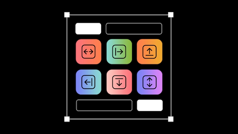
20. Smarter alignment controls
When you use the alignment controls in the Inspector for a layer, it will now align to its immediate parent — whether it’s a group or an Artboard. Great for getting everything lined up!
21. More control when resizing lines
You can now use the ⌥ modifier to resize 2pt lines from the center — just like you would with other shapes.
22. Create equilateral triangles
When you add a Polygon to your designs, you can now us the Sides slider in the Inspector to reduce the number of sides down to three — previously you could only do this in the stepper or the input field. This is really handy when you need to create an equilateral triangle, as you can just create a polygon layer with a 1:1 aspect ratio and use the slider to reduce the number of sides!
23. Snap to quarter pixels
In Vector Editing mode, you can now snap points to quarter pixels for even more accuracy. You’ll also find a new control in the Inspector to do this, so it’s only one click away. We used quarter pixels when we designed our new toolbar icons for Big Sur and Monterey, so we hope this proves useful to designers who want even more pixel precision.
24. Smarter inner shadows
Want an inner shadow to only appear on one edge of your layer? Now you can give inner shadows negative spread values, which will do just that.

25. More precise gradients
You could always use the numbers on your keyboard to set a gradient stop. But before it was limited to a single digit — for example, hitting 5 would set it to 50%. Now you can do it with double-digit precision. So if you want a stop at 75%, just type 75.
26. Add blurs to Alpha Masks
This one does exactly what you would imagine, and opens up some cool possibilities for creating more interesting graphics. Let’s see it in action…
27. Use anything as an Alpha Mask
Yes, you can now use any layer you like — including images with some transparency — as Alpha Masks.
28. Apply background blurs to images
If you’re using semi-transparent bitmap images, it’s now possible add background blurs to them. This might be a good time to grab our very own Joseph Todaro’s Frosted Glass Shapefest packs 😉

29. Drag and drop images
We’ve made it easier to replace images in Sketch. When you drag images into the Mac app, simply drop them over other images — or shapes with image fills — right on the Canvas to replace the current image.

30. WebP support for Data
Want to add a folder of WebP images as a Data source for your next project? No problem — that should save some time on image conversion!
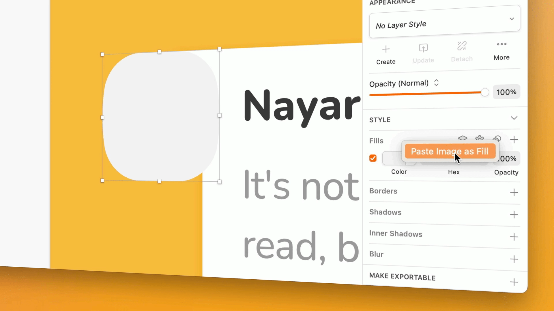
31. Paste Image as Fill
If you copy an image from another app to your clipboard, you can now paste it as the fill of a shape. Control-click on the Fills panel — or on a Fill — and choose Paste Image as Fill. This is great if you want to avoid making a Mask unnecessarily, or when the image you’re pasting is a pattern.

32. See your exported asset’s file name
You know that small bar that pops up when you export an asset from Sketch? Well, now that bar also shows the file name when you export assets individually — giving you a little extra clarity.

33. Higher quality images for high-density displays
Want to copy something out of Sketch and paste it into another app? If you have a high-density display, we’ll automatically create a 2x image for you. So the next time you want to share a mockup on Twitter, post it in a Slack thread, or add it to a deck you’re building, you’ll get a higher-quality image without any extra effort.
34. Automatic prototype start points
When you create a Prototype, we’ll automatically set the Artboard where you created your first Interaction as the start point. So your testers will always start in the right place.
35. A cleaner way to view prototype interactions
We recently added a new Prototype tab to the Inspector that holds everything you need to make your designs more interactive. Selecting the tab shows you all the interactions you’ve created on the Canvas. But when you switch to the Design tab, you’ll only see interactions when you select a layer that has them — to help you focus on what you’re working on.
36. Quicker Interactions when prototyping
With the Prototype tab active in the Inspector, you can click and drag the + handle on the right edge of any selected layer to create an Interaction. It’s as simple as that!
37. Multi-selection prototype linking
Want to quickly add Go to or Back links to multiple Artboards? No problem. Now you can simply select all the Artboards you want to link, add an interaction by hitting W, then link them all to the Go to or Back links with a single click.
38. Override interactions in a Symbol
You can now override any Prototype interaction in a Symbol instance. Previously this was only possible with Hotspots, but you can now do it for Links as well.
Phew — that was a lot of updates! Hopefully there are some helpful tidbits in there that you can use to speed up your workflow in Sketch. We’re always working on little gems like this alongside bigger features, so keep an eye out for more in future updates — we’ve got a lot more to come!


