5 tips and ideas for designing Instagram posts
Every post is a chance to keep your viewers engaged and wanting more
Want to know how to design Instagram posts that’ll keep your followers wanting more? We’ve got you covered. Whether you’re just starting out on Instagram or you’re looking to up your content game, we’ve compiled design tips every creator and business can keep in mind.
Let’s jump in!
Why good design matters on Instagram
First of all, why does good design matter on Instagram anyway? After all, there’s a lot more that goes into creating a great post than making it pretty. You’ve got to think about captions, how many posts you’re sharing per day, what hashtags you’ll use, and so many other factors.
But time and time again, research has pointed out how powerful visuals can be in grabbing our attention. Not only do we process images faster than text, but they also have a better shot at sticking in our long-term memory. So, when planning your Instagram strategy, it’s definitely worth thinking about your content’s visual appeal.
Not to mention that Instagram’s algorithm today makes it easier than ever to discover content from creators you aren’t following. That means anyone in the world could be looking at your content anytime. And good design could make all the difference between someone deciding to scroll past your post and clicking on your handle for more.
Thankfully, designing Instagram posts doesn’t have to be complicated. And with an intuitive design tool like Sketch on your side, all you need to keep in mind are a few general rules of thumb.
5 tips to design high-quality Instagram posts
Ready to up your Instagram game? Here are five tips to keep in mind next time you’re designing your content — including some tips to simplify the process using our Mac app!
1. Use the best dimensions
Instagram lets you upload images of any size. But not all dimensions will set your content up for success. To give your audience the best visual experience, it’s worth checking out Instagram’s size recommendations first.
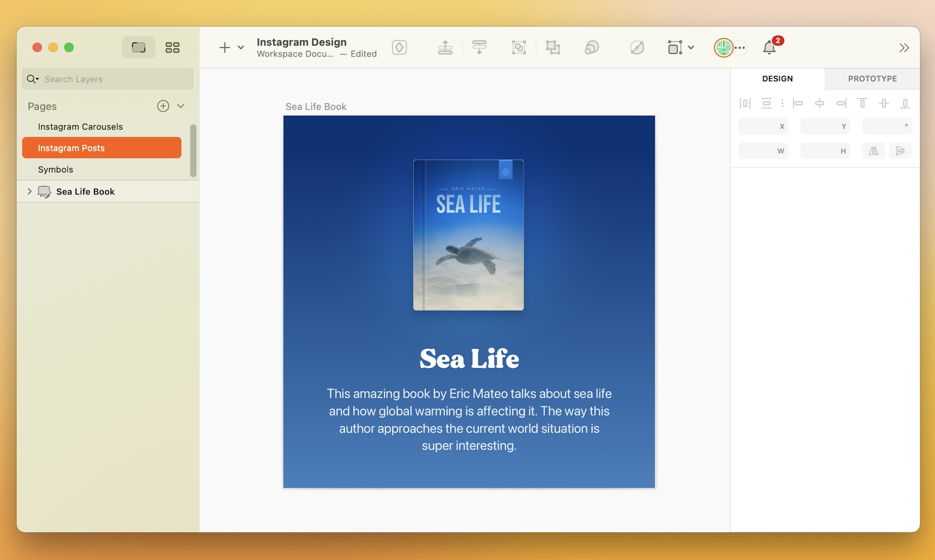
Want to skip ahead? We’ve made this part easy in Sketch with Artboard presets. All you have to do to get the right dimensions in our Mac app is hit A to trigger the Artboard tool, choose Social Media from the drop-down menu in the Inspector, and then choose from a variety of Instagram dimensions in the list. If you’re designing a post or a carousel for your feed, you can choose Post Square, which gives you that classic 1:1 square aspect ratio. Or, if you prefer something that’ll fill your screen more, we recommend choosing Post Portrait, which uses a 5:6 ratio.
Hit A to trigger the Artboard tool, choose Social Media from the drop-down menu in the Inspector, and then choose Post Square.
2. Stick to a color scheme
Like we covered earlier, images have the power to grab your audience’s attention faster than words can. But how do you maximize those first few seconds someone’s looking at your post? For one, with a wicked good color scheme.
If you’re creating marketing content for a business, this is your chance to let your audience get familiar with your company colors. PayPal, for example, often incorporates their logo’s shades of blue in their content. So does Tiffany & Co.
But if you don’t have an official color palette, it’s worth diving into some basic color theory to find out what color combinations work best — not to mention which ones resonate with your brand.
3. Balance out visuals, text and space
They say two’s a party, and three’s a crowd. But with Instagram posts, you can definitely combine three (or more!) design elements and still keep your audience engaged — whether you’re adding text, visuals, icons, or photos. The key to success, though, is knowing how to balance them out and avoid overcrowding your post.
For example, imagine you’re promoting your new book on Instagram and designing a post that includes a screenshot of your book cover. If the book cover already includes a title and an author’s name, you might not want to add too much more text to your design. Instead, you might want to focus on the surrounding color scheme or maybe even add some corner styles.
It’s also worth knowing when to say add nothing at all. That means you don’t need to make sure every inch of your square has something going on. In fact, a clean design can help your audience focus on a single message, rather than have them keep up with multiple ideas.

Knowing how to balance multiple design elements — and how to leave some breathing room — can go a long way on Instagram.
4. Keep your profile’s feed in mind
A well-designed Instagram post has the power to draw your audience out of their feed and into yours. But that won’t matter if your feed only sends them back the other way. It’s all about maintaining a consistent theme across all your posts.
The hashtag tool Display Purposes ranks aesthetic pleasure and consistency as one of top four psychological reasons people decide to hit the follow button. And that decision can happen in just a split second within someone landing on your profile.
Now, that doesn’t mean all your posts need to be identical. But consistency is key. So it’s worth making sure that, when all your posts are lined up in that three-column grid, they form a clear theme — whether that’s based on color schemes, font types, filters, or something else.
5. Break longer content up into a carousel
Got lots to say that you just can’t fit into a 1:1 Instagram post? Try an Instagram carousel! With carousels, you can upload multiple images and videos into a single post — up to 10, to be exact.
Carousels are especially great for sharing a series of content in one go, like tips, comparisons, or event highlights. Foodies, for example, might use carousels to share their top five favorite restaurants in town. Career coaches might use a carousel to share multiple resume-writing tips. It’s like creating a mini presentation, where all the images you include are slides your audience can swipe through.
At Sketch, we don’t shy away from carousels either, whether we’re walking our followers through a design tutorial or celebrating our community’s amazing work!

We can think of Instagram carousels as a mini presentation, where each image is a slide.
As the old saying goes, you can only make a first impression once. And the rules are no different with Instagram content. Each post is a chance to engage with your audience and keep them interested. With these design tips on hand, you’re ready to build a consistent and effective branding strategy that’ll earn you a loyal following.


