How Oskar Groth bridges the gap between development and design
Learn how Oskar Groth uses Sketch with a programmer’s eye to build Sensei for Mac
Oskar Groth, founder of Cindori is the brain and the muscle behind the Sensei app, a comprehensive Mac performance tool. From programming to designing, Oskar does it all — and mainly in Sketch.
In this interview, Oskar shares with us his process and how he balances design and development to bring great products to life.
Your trajectory is really impressive. Not only are you a programmer but have also done all the UI design for Sensei. When did you first get into design?
I started to appreciate design when I got my first Apple product, a first-generation iPod nano. But it wasn’t until I started making apps that I realized that I had to go and acquire my own design skills. I struggled to use any of the tools that were popular at the time — like Photoshop or Illustrator. But around 2015, I came across Sketch.
I found it much more approachable than anything I’d tried before, and I started using it to design parts of my apps. Since then, it’s just been a long journey of learning by doing, slowly getting better, and creating more intricate designs.
Sensei is all about data — but you worked hard to make that data beautiful. Was that a big focus for you with the app?
Yes, absolutely! There’s an immense amount of data about your Mac’s performance and health hidden in macOS. I view it as my job to select and distill it to the most relevant information and present it in a beautiful way.
The reason is two-fold: on the one hand, I want to create a work of art that pays homage to the beautiful, native design of macOS, and fits right at home on the user’s Mac. But on the other hand, it’s also about accessibility. Many performance and system monitoring apps can be quite hard to grasp unless you have a lot of experience with computers.
I want Sensei to be an app for Mac enthusiasts as well as the average user. So the design process is not just about creating nice-looking shapes and colors, but simplifying complex information, and teaching the user how it all fits together.

Showing data in a compelling and aesthetically-pleasing way is always a challenge, but Sensei’s dashboard really delivers.
How do you handle the challenge of packing so much information into your designs — especially when space is tight, like in the menu bar?
Dealing with a ton of highly dynamic data is definitely a huge challenge. I try to think about the data type — can it have a minimum or maximum value, or can I establish a metrics hierarchy? But even then, there are many edge cases that can be hard to predict across the various Mac models.
In the case of the Monitor [Sensei’s menu bar feature], there’s a lot of optimization behind the scenes to format data in the most optimal way. For example, maybe you don’t need to see every single one of the 24 or so CPU temperature sensors — Sensei can just calculate an average CPU temperature for you and display that value instead.
By carefully evaluating other data points in similar ways, the information can be condensed into the most optimal representation. And after that, it’s just a matter of presenting it in a nice way, which usually involves many hours of shifting singular pixels back and forth until it looks just right 😄

Sensei can show you as much or as little as you like, but Oskar needs to design the app so that it looks great regardless of the user’s preference.
What’s your process like? Do you start with a design and program later or vice-versa?
After I have an idea, I always start by creating a collage of designs that I like. It could be designs from other apps with similar features, or completely unrelated conceptual designs that showcase a particular piece of UI that I think might be interesting to explore. Having this wall of inspiration is a great way to keep the ideas flowing and not get stuck.
After that, I do a rough mockup that can include something like the application window and basic view hierarchy. Apple’s Design Resources for Sketch really comes in handy here, as I can quickly drop in accurately-designed macOS system components as Symbols. It’s very important to me that all the design components are Symbols, so that any updates to the design will automatically permeate to all the other parts of the design.
When I have a rough idea of what I want, I usually start with programming. While developing the app, you often encounter so many things that will challenge your understanding of how the feature should work. I usually return to Sketch several times to refine some of the prototypes and begin to create some new prototypes for finer details like buttons and icons.
At the end of the development process, I usually have something that is around 90% close to what I will actually be shipping. At that point, I spend some time refining the design, creating final versions of assets, and maybe using them to create promotional artwork.

Check out part of Oskar’s Symbols collection in Sketch.
Sensei fits right in with macOS, but you’ve still included some beautiful realistic illustrations of fans, batteries, and more. How do you find the balance between UI design and realism?
It is really tricky! I definitely enjoy creating artwork that depicts the beautiful hardware design of Apple products. But in some cases, there isn’t enough space for an intricate icon, and I need to use a simple Symbol instead.
In some cases, the icon may be too realistic to convey the intended message. For example, modern Mac SSD drives are basically just a couple of tiny memory chips. But I still use the standard disk icon with the old spinning hard drive for Sensei, because that’s what users are familiar with.

A side-by-side comparison of Apple’s original battery and Oskar’s Sketch illustration.
What quick tips can you offer designers that want to start creating more realistic designs, like the battery above? Are there any specific Sketch tools or techniques you’d recommend?
I’d say that, even if you’re not going for highly realistic designs, you should research how the thing is presented in reality. If it is a piece of hardware, what shapes does it come in? What colors? How does the light reflect on various parts of it? How would you describe it in words? Once you get the basics right, it’s all about shadows and gradients to get that realistic look. And usually, that just involves a lot of trial and error.
Even if you’re not going for highly realistic designs, you should research how the thing is presented in reality.
Why do you like using Sketch for skeuomorphic design?
I think Sketch really gets the basics right, which for me are things like vector editing, masking, shadows and colors. These sound super simple on their own, but together they make up the toolkit you need to create a high-quality design. And because Sketch makes them super easy to use, I find it easier to work with — and I often arrive at slightly better results using Sketch than other similar tools.
I think Sketch really gets the basics right, which for me are things like vector editing, masking, shadows and colors. These sound super simple on their own, but together they make up the toolkit you need to create a high-quality design.

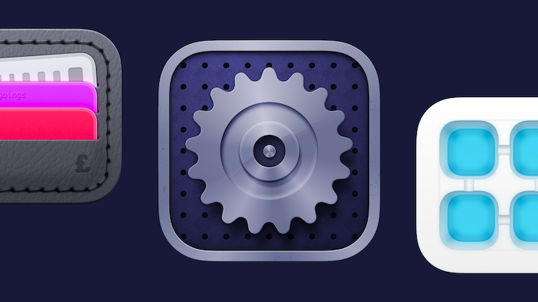
Here are some cool skeuomorphic icons Oskar created in Sketch.
Do you feel it’s difficult to keep up with the evolution of design and programming at the same time? How do you manage that?
Definitely! When you’re an indie developer, you have to wear many hats. Sometimes, I can get lost for days doing only design research, and it comes at the cost of precious time that I could spend programming. My best strategy would be to follow many great developers and designers on Twitter, that way I always have somewhat of an idea of what is coming next in both fields.
What do you like about Sketch from a programmer’s perspective?
As a Mac developer, I can definitely appreciate the native experience of Sketch. It’s more responsive and performant than other tools out there. But in terms of functionality, I think I enjoy Symbols the most.
Designing with Symbols is super powerful, and you can build up a whole design system that powers your design. I think it helps to reason about your user interface components this way, because it’s precisely what would be considered good practice on the programming side as well.

Here’s another look at how Oskar works with Symbols, which saves him a lot of time when he’s ready to start programming.
What’s one piece of advice you would give to young programmers starting out and needing to do their own designs?
Even though I’ve spent countless hours in Sketch by now, I still don’t see myself as a designer. I make digital products, and part of making great products requires making great designs. I think it’s a misconception that you have to be born a designer to become good at it; it’s as much an acquired skill as programming.
I see many other indie developers who are great programmers but don’t see themselves as a designer, so they never even dare to try it. I’d say that if you’re serious about building a great product, you should be serious about learning design as well. It might be a long journey, but it will most definitely pay off in the long run.
I see many other indie developers who are great programmers but don’t see themselves as a designer, so they never even dare to try it. I’d say that if you’re serious about building a great product, you should be serious about learning design as well.
Have you developed an awesome product in Sketch? Used Sketch to create an artistic masterpiece? Share it with us and we might feature you in our next #MadeWithSketch post.


