Top 5 best Android app design practices
Learn how to design chart-topping Android apps with this ultimate guide
If you’re thinking about creating a mobile app and breaking into the crowded Android market, making sure it’s optimized for the operating system is key. Did you know that 72% of mobiles run on Android? In fact, nearly three-quarters of the phones purchased by end-users in 2021 had Android OS — that’s over 1 million phones you could be found on!
While those numbers are impressive, they also mean that there’s quite a bit of competition. So how do you go about making sure your app succeeds in the Android marketplace?
In this guide, we’ll walk you through some best practices for Android app design development that’ll make your app stand out from the crowd.
Let’s dive in!
How to design an Android app
There’s a lot to think about when designing an Android mobile app, so we’ve put together a step-by-step guide to help you streamline the process.
Getting started
Before designing any aspect of your new app, there are a few initial steps you should complete to make sure you or your team are working cohesively towards the final product. To note, these helpful tips can work for any app design, whether it’s Android or not.
1. Setting the goal
Think about what you want to design and define what it should accomplish when it’s finished. How will you make it appealing to users? What problem are you solving? How will it beat your competitors?
2. Make a plan
Once you have a goal, you can make a plan. Dive deeper into how to turn your aspirations into reality by settling on a budget, timeline, and initial design route detailing key app functions you’ll want to include.
3. Research your audience
Even if you feel like you know your audience well, research the sector you’re launching in. Understanding the existing market is the easiest way to increase your chances of success, but it’s a step many often overlook.
4. Research your competitors
There’s nothing new under the sun, so learn about your competitors to gain a better understanding of the market and the apps that succeed in it. A good place to start is going through customer reviews in the Play store and identifying existing pain points you could help resolve.

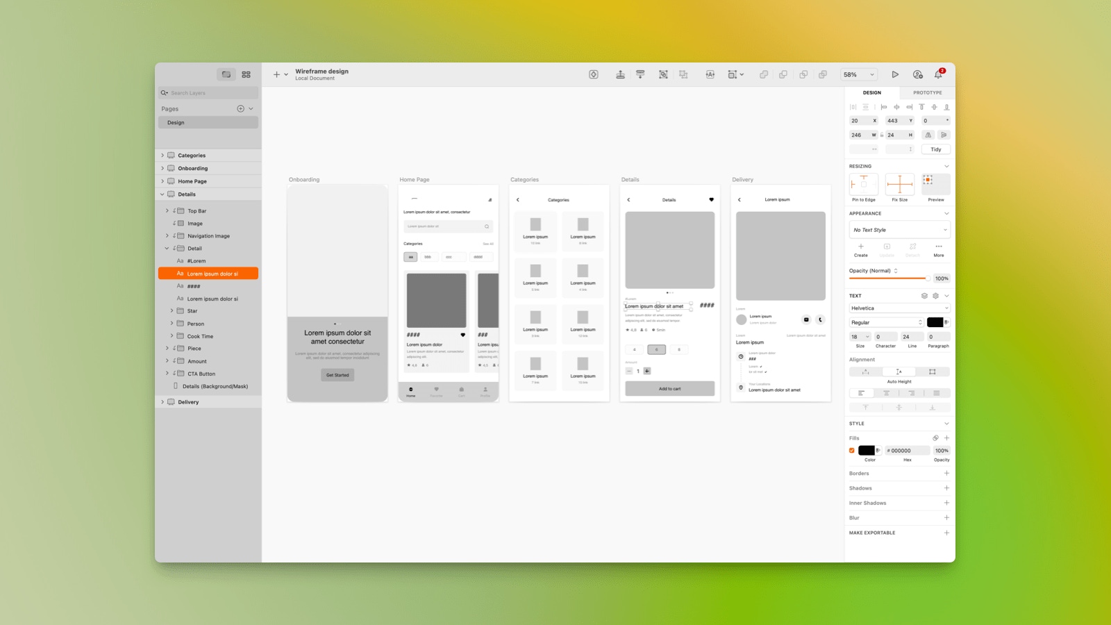
You can easily create wireframes in Sketch to start bringing your app to life.
Design and development stage
Once you’re happy with your goals, plan, and research, it’s time to start designing and developing your new app.
1. Wireframe creation
A wireframe is an important blueprint for any app’s design and functions. Don’t worry too much about making specific design choices at this stage — instead, focus on potential navigation structures and workflows. You can try out a few options and then choose whichever feels the most intuitive for the user.
2. Design
To bring your design to life, you could start by creating a moodboard to see how different creative lines could visually fit together. Then, when you feel you’ve got it just right, create a few realistic mock-ups to put your creative vision to the test. Things to consider during the design process include:
Throughout the process, consider how to make your app’s user interface (UI) look professional and attention-grabbing. Fonts, colors, button design, and messaging hierarchy are some of the tools you can use to create a memorable UI design.
3. Feedback
Whether it’s friends, family, or industry peers, ask for honest feedback so you can make informed decisions about any possible changes. But don’t stress too much about catching every little thing. There’ll be more opportunities to receive feedback once we reach the development stage.
4. Development
It’s time to put your UI design to the test. With the help of a developer, make any adjustments your design might need to work smoothly in the real world. Was your title text too big or the hotspot on a button too small? These are some of the questions you might want to consider with your developer.

Did you know Sketch’s robust handoff tools are accessible from any operating system? Theyre all included in your subscription – no extra plug-ins or extensions needed!
Test and launch
Now that your app is ready and functional, here are some of the steps you can follow to make sure it can fly out of the nest.
1. Focus group
With the help of the same people who looked at your mock-ups or a fresh set of eyes, this testing phase is about getting feedback before making final adjustments to the app.
2. Beta version
Beta testing lets you see how users actually feel about your product and how the mobile app operates in the real world. The more you prioritize this stage, the more you’ll be able to troubleshoot before launch. That means fewer bug reports and complaints!
3. Launch!
Time for lift-off! All your hard work has finally paid off and the app is ready to go to market. Upload an app file onto Google Play so people can start using your product straight away. However, be mindful that great apps are all about iteration. You’ll likely have to continue providing updates as you make changes, and improvements, and squash those unavoidable, pesky bugs.
What is a good app design practice?
Now that you understand the process of designing an app, let’s look at some best practices you should consider when designing a new Android app.
Quick guide to Android design elements
As a quick summary of key design elements for Android, check out our guide below:
| Design Element | Android |
|---|---|
| Defining dimensions | Device-independent pixels (dp) |
| Minimum tap target size | 48x48 dp |
| Main app navigation | Tabs at top of screen |
| Secondary navigation | Bottom nav OR “hamburger button” side menu |
| Primary action button | Floating button, bottom right |
| Single-choice lists | Radio button list |
| Multiple-choice lists | Checkbox list OR list with switches |
| Back button | Permanent back button OR swipe from either side of the screen in |
| Action menus | Appears from the button when there are multiple options OR directly on element if shorter |

Looking for inspiration? Check out these wireframe examples.
The user is king
No matter how you decide to design your new Android app – remember that the user is king and everything should center around them. A good place to start is making sure your app is accessible. Anytime you want to add something to your app, ask yourself if it’ll meet your audience’s needs. If not, then it’s probably not worth the add.
A great way to get your user to spend more time on your app is by focusing on personalization. You can personalize the user experience by tailoring messaging, bringing relevant content to the homepage based on their interests, or even something as simple as using the user’s name where possible.
Keep the app clean and uncluttered
No one likes a cluttered space, and your users are no different. Here are some ways to keep your app clean and simple:
- Cut features that won’t impact the app’s goals
- Limit calls to action to one per screen
- Watch out for overlapping images
- Add spacing and padding to each page
- Limit the amount of text per screen
Note: Within Android apps, many primary CTAs will appear as floating action buttons in the bottom-right corner. While you should only use them when appropriate, they’re a great, clean way to help users to complete an action.

With Sketch, creating sleek designs is a breeze thanks to features like Smart Distribute.
Keep your layout responsive
While all your users will be using Android, you’ll have to cater to different devices. Responsive UI design is key to making sure the app fits different screen sizes as well as orientations and device states. For example, the same UI element would appear smaller on a low-density screen than on a high-density one.
To help make the app design process easier, here’s a cheat sheet with six density buckets created by the team at Android:
| Density level | Density-independent pixels |
|---|---|
| ldpi (low) | 120dpi |
| mdpi (medium) | 160dpi |
| hdpi (high) | 240dpi |
| xhdpi (extra-high) | 320dpi |
| xxhdpi (extra-extra-high) | 480dpi |
| xxxhdpi (extra-extra-extra-high) | 640dpi |
Here are two core principles to keep in mind to keep your UI design responsive:
- Flexibility: the layout should make the most optimal use of the available screen space and be ready to adjust whenever necessary – such as growing to a single view, hiding additional features, or repositioning buttons so that they’re more accessible.
- Continuity: the changes should be seamless and the transition painless for the user. This includes no interruptions in app usage or the user losing their data.

With Sketch, making your app responsive is easy. You can make use of our resizing tools to create responsive-ready elements such as buttons, menu bars, and screens.
Keep it consistent
When designing your app, keeping the content, tone of voice, branding, and design consistent can be hard, but it’s vital for UX. By creating templates, a color palette, and settling on some Text Styles, you can easily create a design that is cohesive throughout your app.
Consistency also applies to general Android best practices as well so the user has a consistent experience against other apps. A few quick ways to give your app that Android feel is making sure your buttons are no smaller than 48dpi and that your selection controls display as drop-downs or pop-ups.

In Sketch, you can create Symbols of common elements like buttons, which work as templates that you can replicate across your design.
Navigate with ease
Your app may be incredible, but the user won’t be able to tell unless they can find their way around. Keep the navigation discoverable, consistent, and available at all times. By keeping your navigation bar or menu simple and useable, you’re more likely to engage the user for longer, improve their experience and keep them coming back for more.
Navigating through the app with ease also means trying your best to keep all the content within the app. If the user has to open a browser to view some of your content, it defeats the app’s purpose. So, it’s only natural that breaking that seamless experience will result in a lower adoption rate.
Now that you’re armed with best practices on Android app design, it’s time to try them out for yourself! Play around with your design and make it as user-friendly as possible. And remember: if it won’t meet your audience’s needs, it’s probably not worth the add.


